Responsive vs. Adaptive Design: What’s Best for Your Business Website?
Introduction: Why Web Design Choices Matter in 2025 In today’s fast-paced digital world, your website is more t...

lalit Kumawat
Oct 27, 2025Introduction: Why Web Design Choices Matter in 2025
In today’s fast-paced digital world, your website is more than just an online presence — it’s the face of your business. As technology evolves, users are browsing websites on multiple devices — from smartphones and tablets to smart TVs and even wearables. To deliver a seamless experience, your website’s design must adapt to different screen sizes and devices smoothly.
That’s where responsive and adaptive design come into play. Both are strategies to make websites look great and function well across devices. However, the difference between responsive and adaptive design can significantly impact your website’s speed, SEO, and user experience.
At Soumya IT Solution, we specialize in crafting high-performance, mobile-optimized websites using the latest responsive and adaptive design technologies. In this article, we’ll break down what each design type means, their pros and cons, and which one is best for your business in 2025.
What is Responsive Web Design?
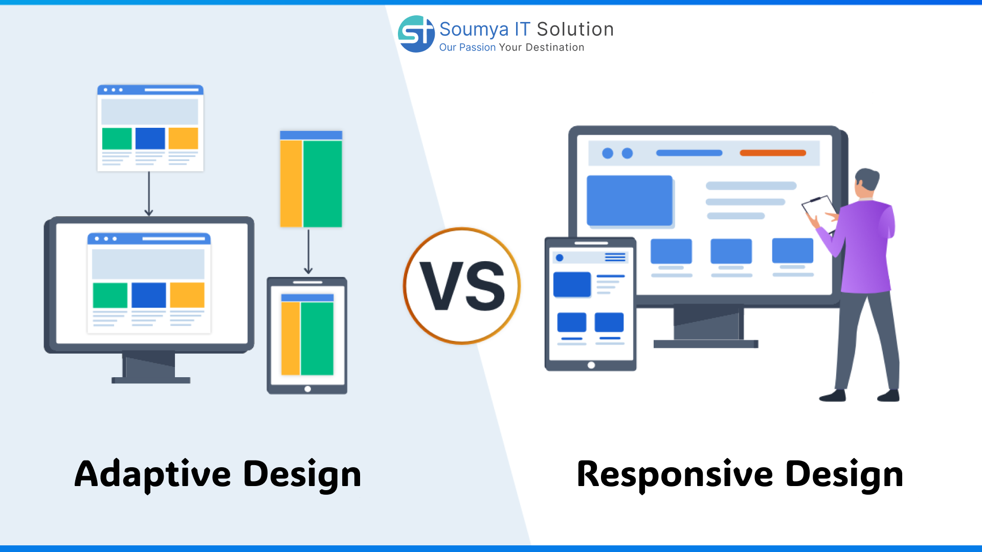
Responsive Web Design (RWD) is an approach where a website’s layout automatically adjusts based on the user’s screen size. It uses fluid grids, flexible images, and CSS media queries to create a dynamic layout that resizes and repositions elements in real-time.
In simpler terms — no matter what device you use, a responsive website will look perfect without needing a separate version for mobile or tablet.
✅ Key Features of Responsive Design:
-
One single website for all devices
-
Automatically resizes based on screen dimensions
-
Uses flexible grids and images
-
Ideal for SEO (Google recommends it)
-
Lower maintenance cost
Example:
Open soumyaitsolution.com on a laptop, then on your mobile. Notice how the layout automatically adjusts — that’s responsive design in action.
⚙️ What is Adaptive Web Design?
Adaptive Web Design (AWD) is slightly different. Instead of using one flexible layout, it creates multiple fixed layouts designed for specific screen sizes. When a user visits the website, the server detects the device type and loads the most suitable version.
✅ Key Features of Adaptive Design:
-
Uses predefined layouts (e.g., for mobile, tablet, desktop)
-
Offers pixel-perfect control for each device type
-
Often loads faster on specific devices
-
Great for targeted user experiences
⚠️ However:
Adaptive design requires more maintenance since you need to design multiple layouts separately.
📊 Responsive vs. Adaptive Design: A Clear Comparison
| Feature | Responsive Design | Adaptive Design |
|---|---|---|
| Flexibility | Fully fluid and flexible | Fixed layouts for different devices |
| Maintenance | Easy to maintain | Requires multiple versions |
| Speed | Slightly slower (more code) | Faster on specific devices |
| SEO Advantage | Excellent for Google ranking | Moderate |
| Development Cost | Lower | Higher |
| User Experience | Seamless on all devices | Custom for each device |
| Best For | Most businesses & startups | Large-scale, high-traffic sites |
Why Responsive Design is the Future (and Google’s Favorite)
Google has clearly stated that it prefers responsive web design because of its mobile-first indexing approach. This means Google primarily crawls and indexes the mobile version of your site. If your website isn’t responsive, you risk losing visibility and traffic.
Benefits of Responsive Design for SEO:
-
Improved User Experience (UX): Users stay longer on your site when it’s easy to navigate.
-
Faster Loading Speed: Optimized pages reduce bounce rates.
-
Better Ranking: Google rewards mobile-friendly websites.
-
Reduced Maintenance: One site handles all devices efficiently.
At Soumya IT Solution, we build responsive websites optimized for SEO, speed, and performance — ensuring your business stays ahead of the competition.
When to Choose Adaptive Design
Adaptive design is ideal when you want to deliver a highly customized experience for each device type. For example, an e-commerce platform might want different interfaces for mobile and desktop users.
✅ Best Use Cases:
-
Enterprise-level platforms
-
Complex e-commerce websites
-
Applications needing specific layouts per device
-
Websites targeting performance over flexibility
Example:
A large travel website may use adaptive design to show different booking interfaces for desktop and mobile users — optimizing the experience and loading time separately.
How to Decide: Responsive or Adaptive?
The right choice depends on your business goals, budget, and audience.
| Goal | Best Design Choice |
|---|---|
| Improve SEO and reach | Responsive |
| Create tailored experiences | Adaptive |
| Lower cost and maintenance | Responsive |
| Need high performance for each device | Adaptive |
| Small business/startup | Responsive |
| Large enterprise | Adaptive or hybrid |
Soumya IT Solution helps businesses analyze their digital goals and choose the best design approach — whether it’s responsive, adaptive, or a hybrid combination.
The Role of Responsive & Adaptive Design in 2025
The web design landscape is changing rapidly. In 2025, users expect speed, accessibility, and immersive experience — no matter which device they use.
🔮 Upcoming Trends to Watch:
-
AI-powered responsive layouts: Automatically adjusting designs using user behavior.
-
Voice-responsive web design: Websites that adapt for voice search and commands.
-
Hybrid responsive-adaptive systems: Combining flexibility with speed.
-
Augmented Reality (AR) elements: Integrated into responsive websites.
-
Dark mode & accessibility-first design: To enhance comfort and usability.
At Soumya IT Solution, we’re integrating these futuristic trends to make websites not only responsive but also AI-optimized, accessible, and engaging.
Why Your Business Needs a Design Upgrade
If your website isn’t optimized for multiple devices, you’re already losing potential customers. Studies show that over 70% of web traffic comes from mobile devices — and users expect lightning-fast, intuitive experiences.
🚫 Problems with Outdated Web Design:
-
Poor mobile visibility
-
Slow loading times
-
High bounce rates
-
Lower search engine ranking
A modern, responsive design ensures your business stays competitive. Soumya IT Solution can redesign your site with SEO, UI/UX, and mobile optimization at its core.
How Soumya IT Solution Can Help You
We are a leading IT and web development company that helps businesses transform digitally through innovative design and technology.
Our Services Include:
-
Responsive Web Design & Development
-
Adaptive & Hybrid Design Solutions
-
SEO and Performance Optimization
-
Mobile-first UI/UX Design
-
Website Redesign and Maintenance
-
AI-driven Website Analytics & Automation
Why Choose Us:
-
Experienced web developers and designers
-
100% SEO and mobile-friendly design
-
Tailor-made solutions for all industries
-
Competitive pricing with top-tier quality
-
End-to-end support for development, hosting & optimization
Case Study: Responsive Redesign Boosted Traffic
A retail business partnered with Soumya IT Solution to redesign its outdated website.
After switching to a responsive design, the results were outstanding:
-
70% increase in mobile traffic
-
45% higher conversion rate
-
Reduced bounce rate by 38%
-
Improved Google ranking within 3 months
This is the power of a well-optimized responsive website — and your business can achieve the same success.
💬 Conclusion: The Smarter Way Forward
In the battle of Responsive vs. Adaptive Design, there’s no one-size-fits-all solution. However, for most businesses in 2025, responsive design remains the smarter, more cost-effective, and SEO-friendly choice.
Your website should grow with your business — and not limit it.
At Soumya IT Solution, we help you build a digital foundation that performs beautifully across every device and platform.
📞 Let’s Build Your Future-Ready Website
👉 Contact Soumya IT Solution Today!
📧 Email: sales@soumyaitsolution.com
📞 Call: +91 77372 33764 | +91 80581 64478
🌐 Visit: www.soumyaitsolution.com
FAQ - Frequently Asked Questions
Recent Blog
-
 Top 10 E-Commerce App Development Companies in USA (2026 Guide)
-
 13 Reasons to Choose Flutter App Development in 2025
-
 React Native App Development: From Idea to Execution in 2026
-
 Top 10 Flutter App Development Companies: Best Choices for 2026
-
 WhatsApp SIM Binding New Rules: What They Mean for You & How They Will Change Messaging in India (2025 Guide)
Start Your Journey To Success